Environmental Design & Brand System
Sparus Tradeshow Experience 2025
Not where it started, but where things started to shift.
Sparus Holdings needed a tradeshow booth design system that could evolve across multiple utility industry events, including DISTRIBUTECH, TechAdvantage, and AGA. The structure, branding, and overall presence were established, recognizable, and built to scale across shows.
But after seeing it in multiple environments, I started to notice where things could be stronger.
This year became less about building something new and more about understanding what was actually working.
Building From What Already Worked
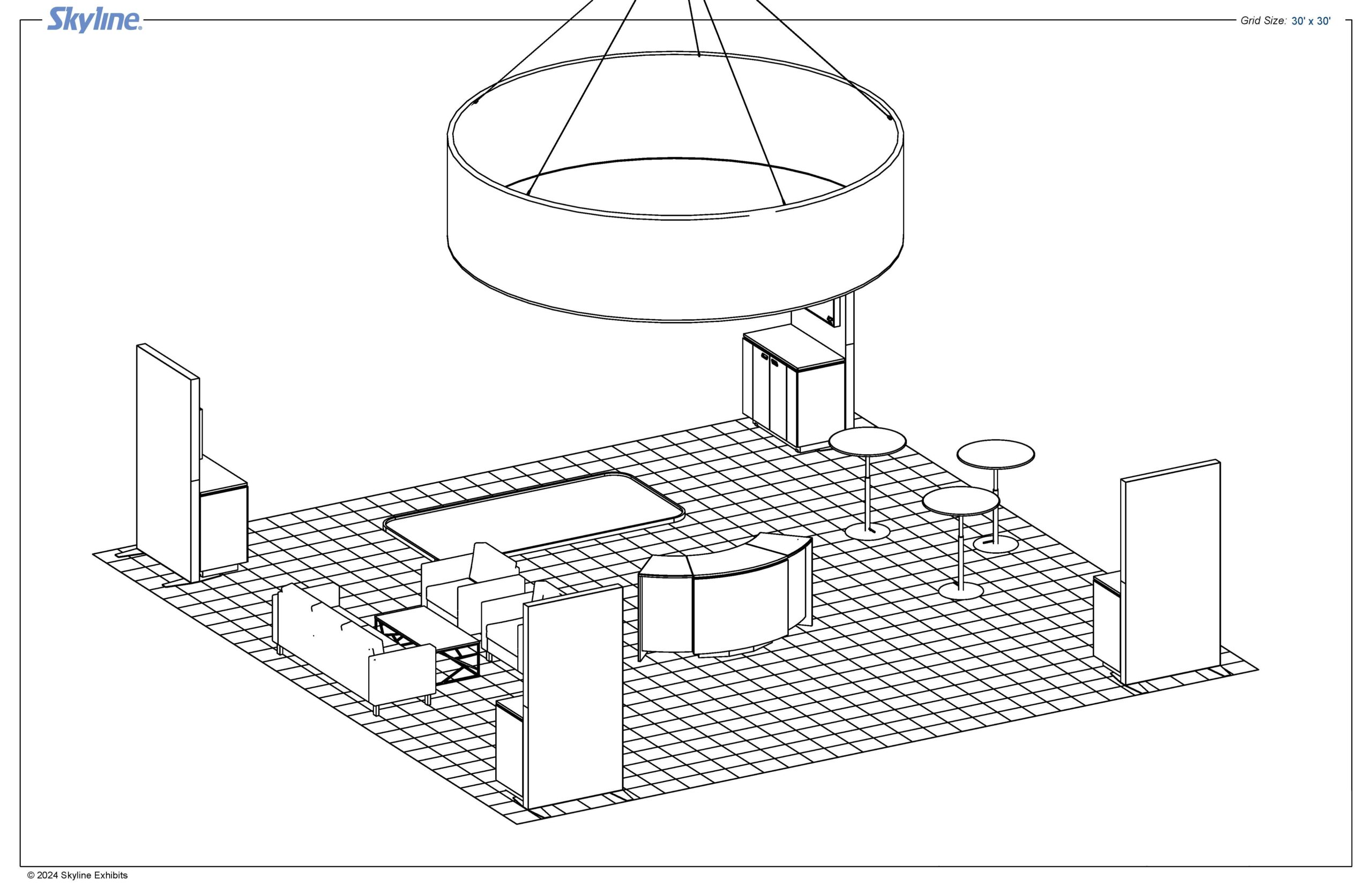
The core structure did not need to change.
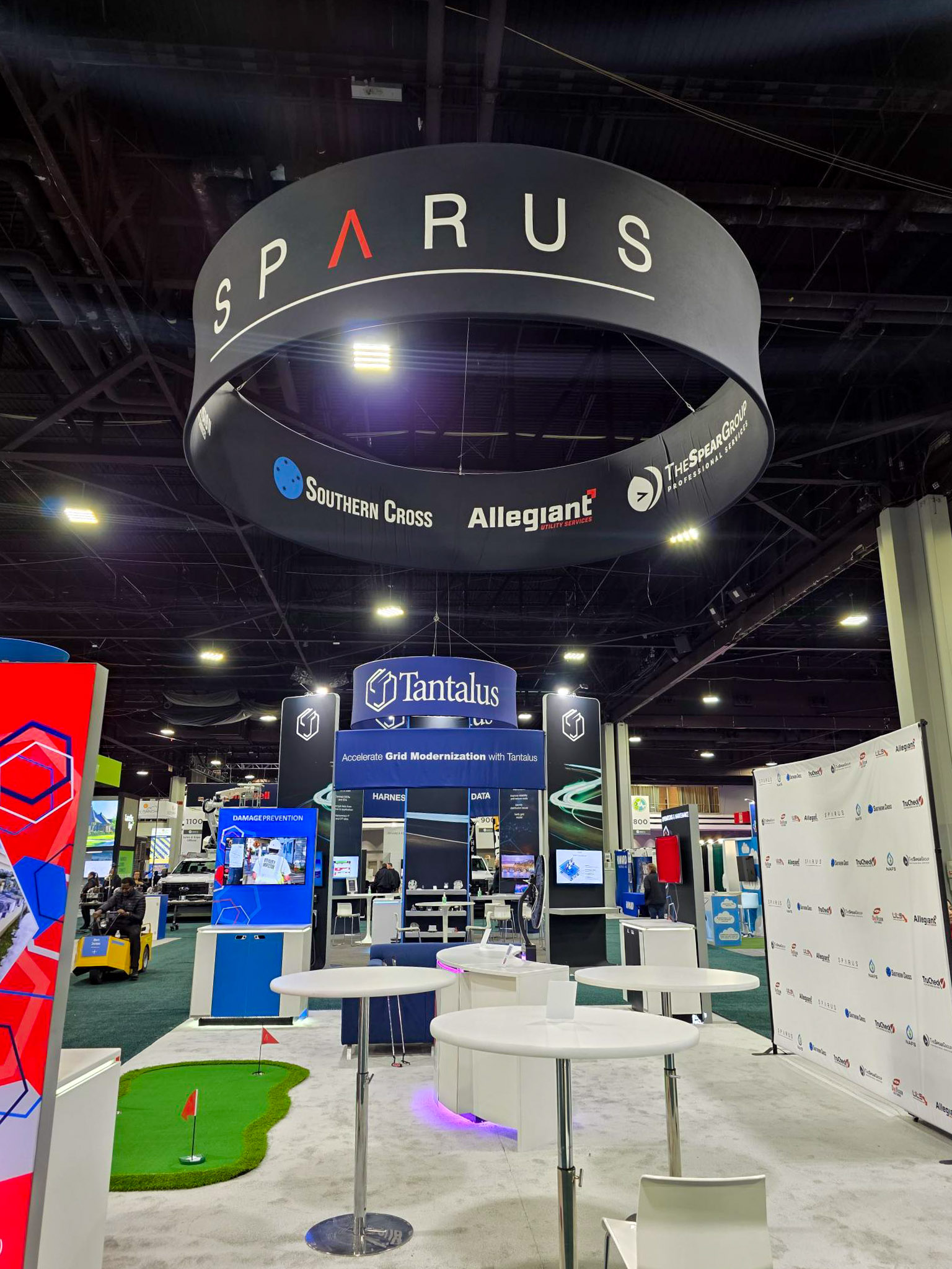
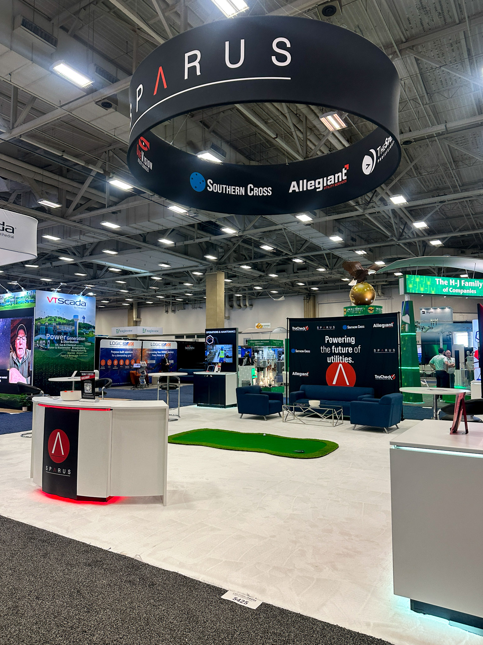
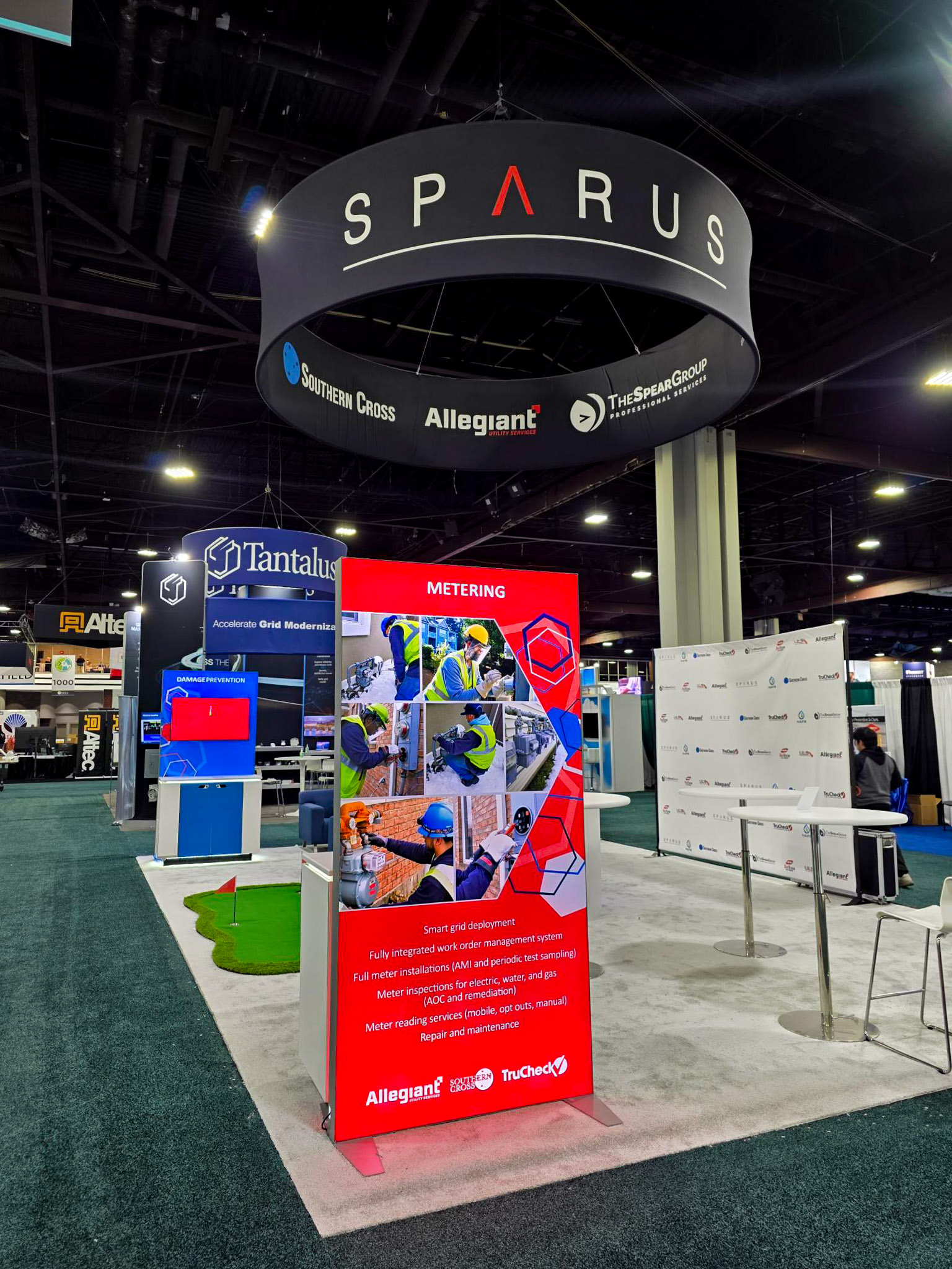
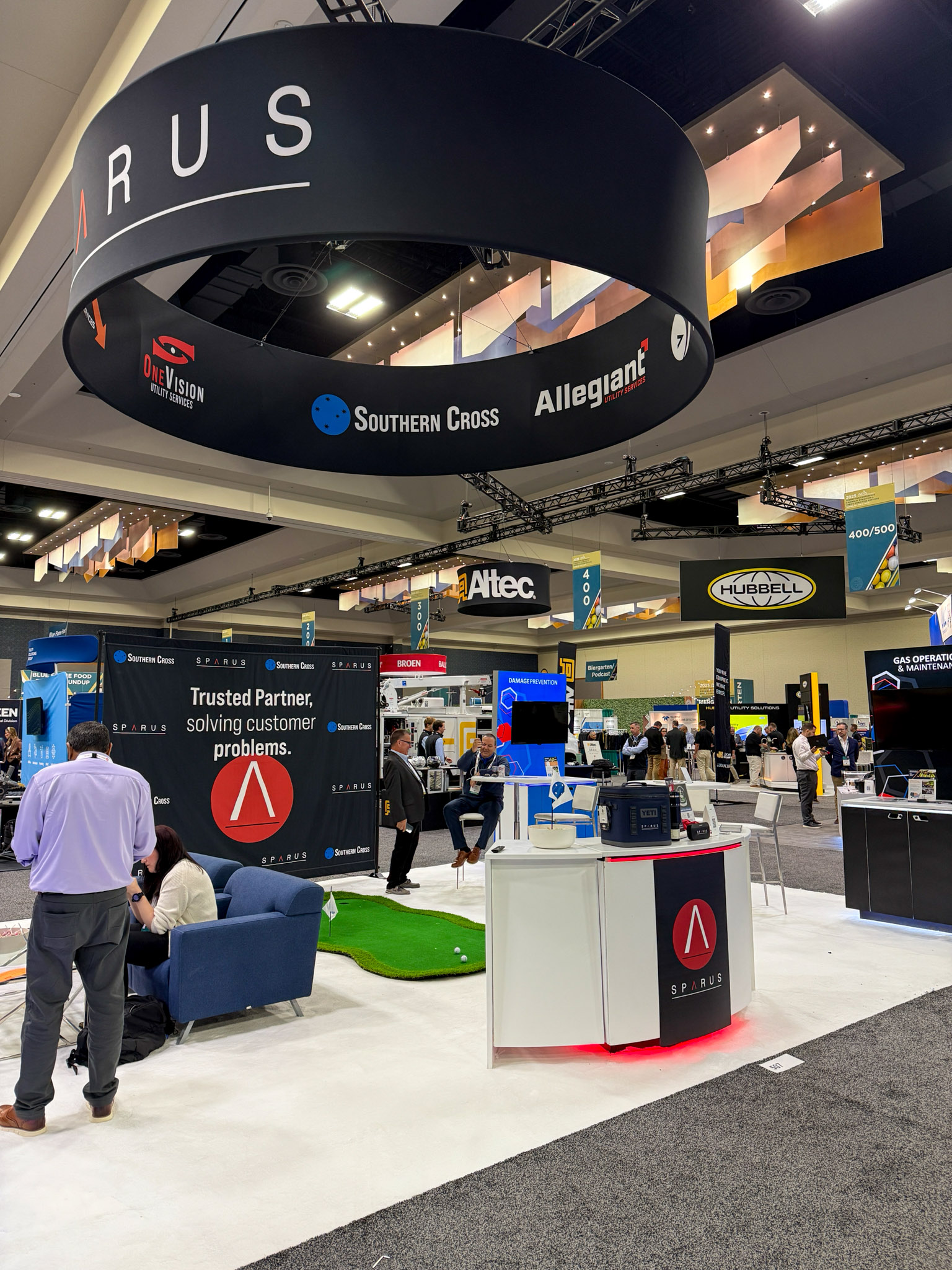
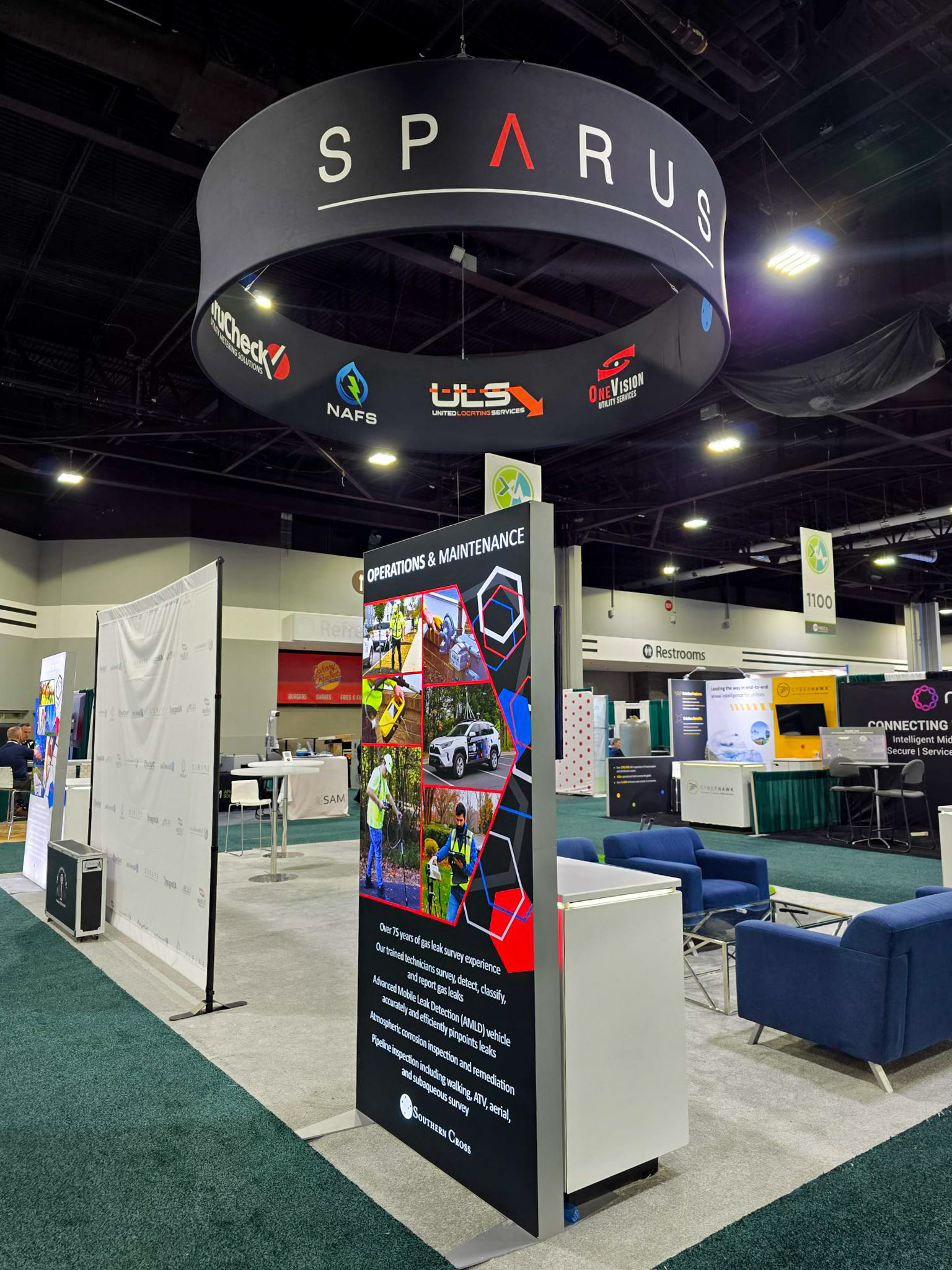
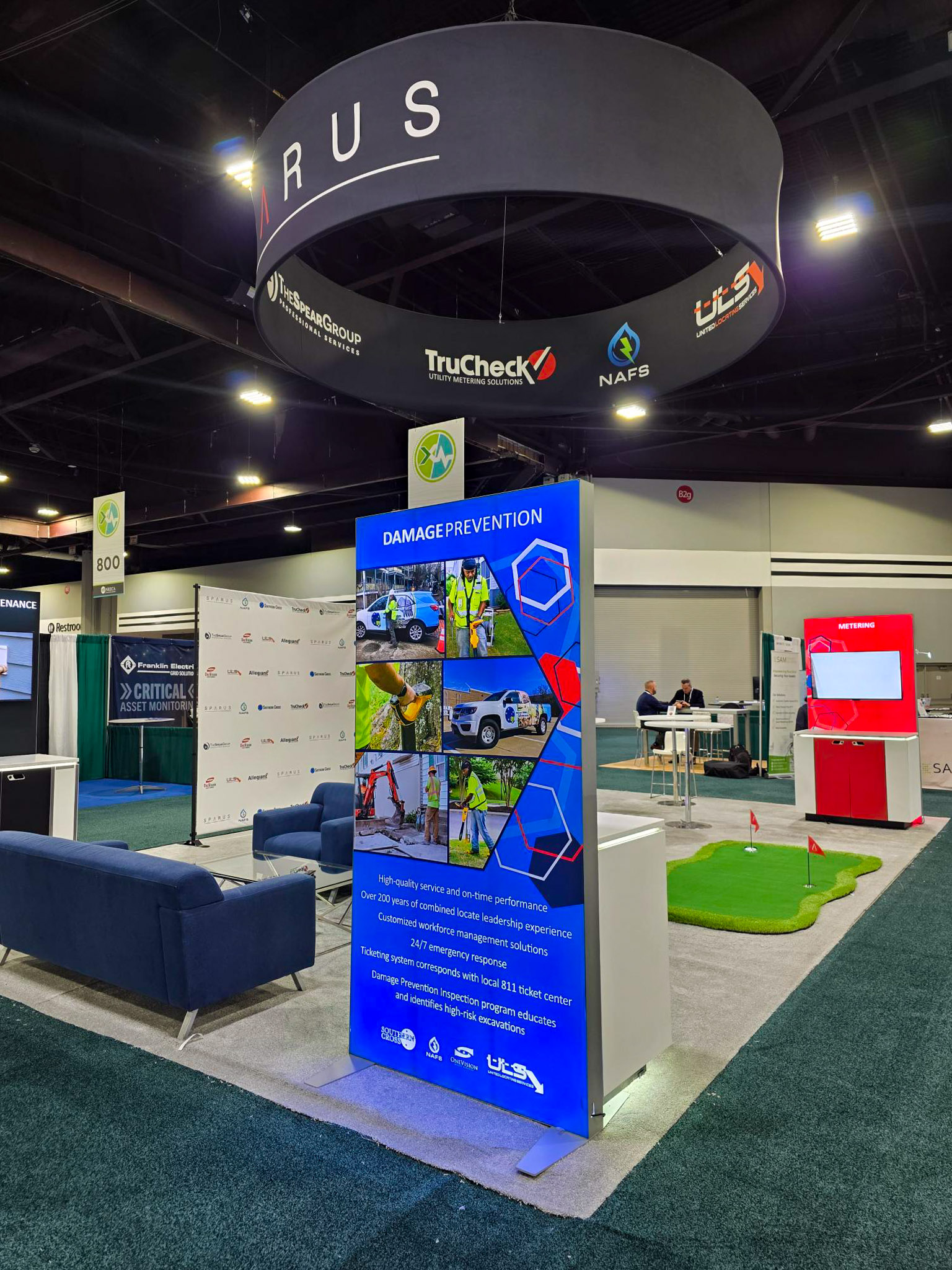
The overhead ring, central tower, and surrounding panels created a strong presence on the floor. From a distance, the booth was visible. From up close, it carried the brand clearly.
What needed attention was not the structure itself, but how everything functioned once people stepped into the space.
Consistency That Carried Across Every Space
One of the most important things to maintain was consistency.
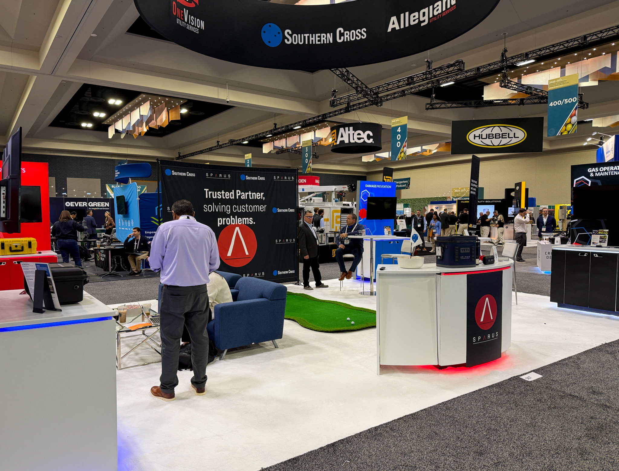
No matter the show, the booth needed to feel like Sparus. The color system, typography, and overall layout carried across each environment without losing identity.
That consistency became something to refine, not reinvent.
Each Show Made It Better
Every show gave me something to learn from.
Where people paused.
What they ignored.
What sparked conversation.
What needed explanation.
Instead of resetting each time, I started paying closer attention to those moments and using them to shape the next iteration.
The booth was no longer just something to set up. It became something to observe and improve.
Designed to Work, Not Just Look Good
This is where the shift really started to take shape.
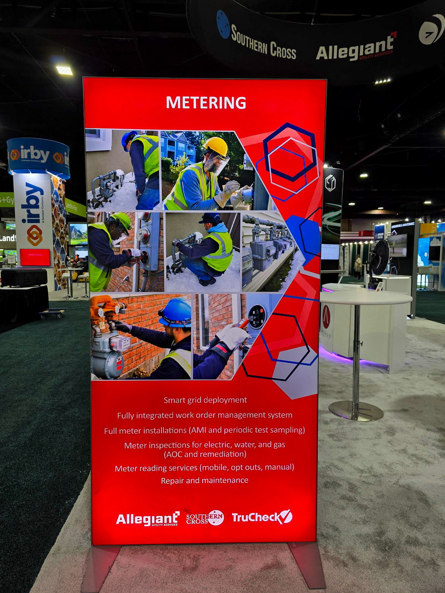
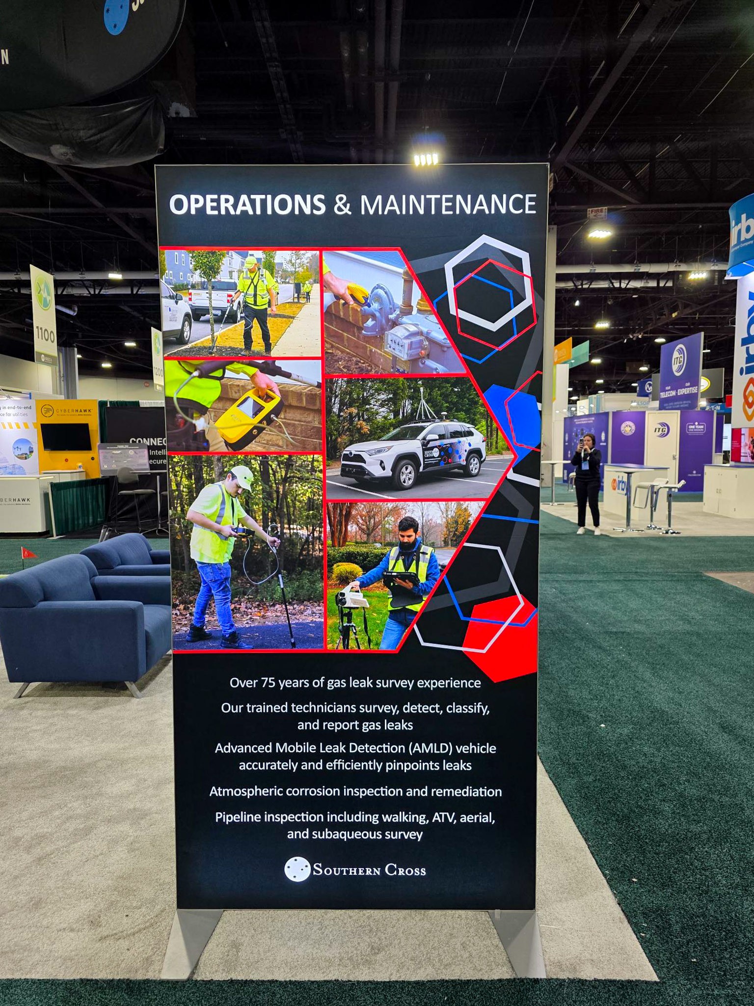
Not everything that looked good in a layout translated well on the show floor. Some messaging was too dense. Some placements did not land the way they should. Some experiences depended too much on someone being there to explain them.
So the focus became clearer.
Make it easy to read.
Make it easy to understand.
Make it work without needing explanation.
Where This Leads Next
2025 created clarity.
It showed what was working, what needed to change, and where to invest more intentionally. That direction carried directly into 2026, where the environment expanded into something larger and more immersive.
This year was not about scale. It was about getting it right.
Color, Messaging, and Flow
The system was already there. It just needed to be used more intentionally.
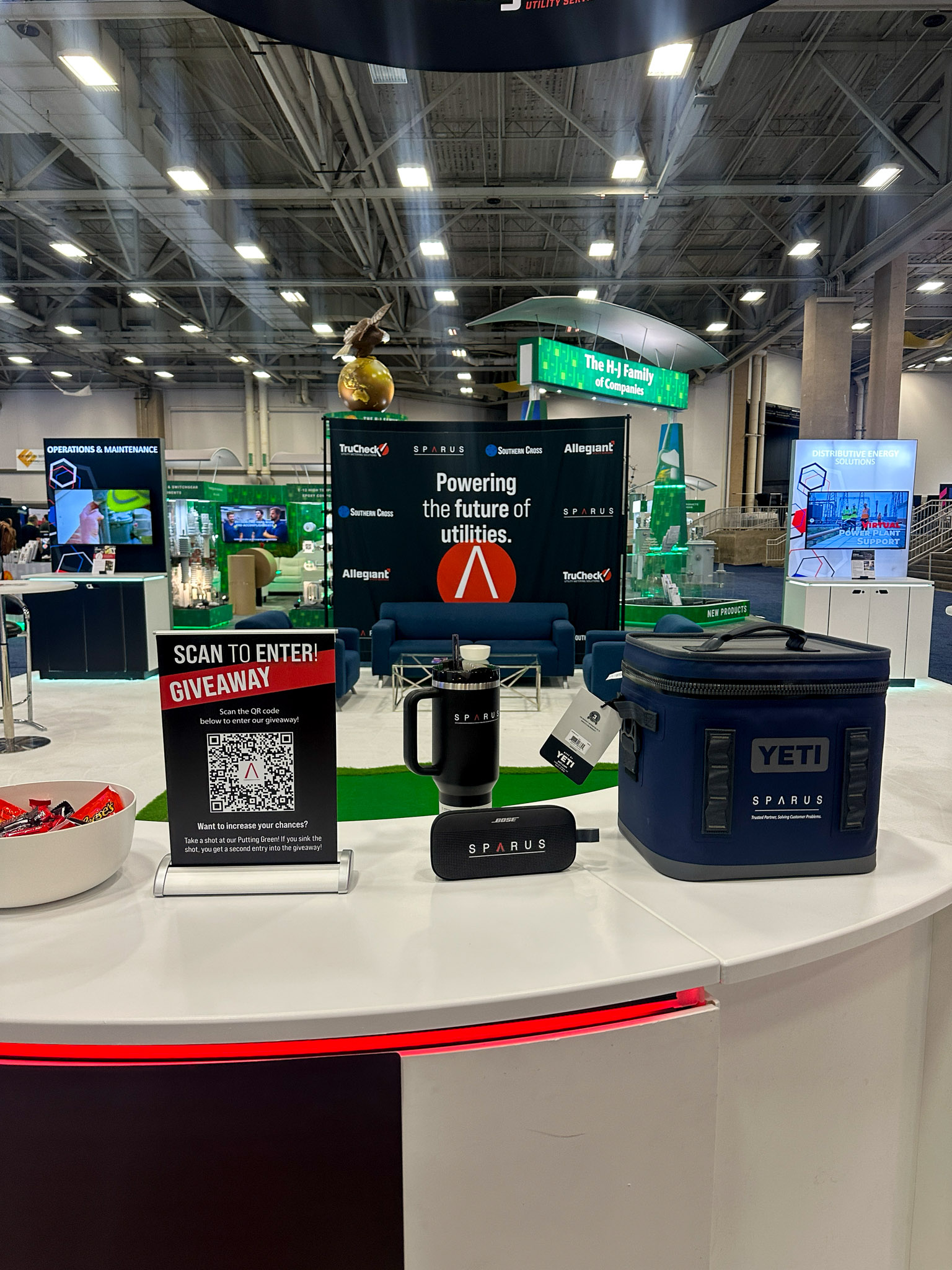
Color became a way to guide attention, not just differentiate services. Messaging became more direct and easier to scan. Layout decisions started to consider how people actually move through the space.
It was less about filling panels and more about creating flow.
What It Looked Like in Motion
Designed to be seen from a distance and understood up close.
Doing More With What We Had
With a limited budget, the focus was not on building something new.
It was on making what we had work better.
Many of the elements were reused from previous shows. Structures, panels, and materials were adapted and reworked instead of replaced. Working within those constraints became part of the process. It pushed the design to be more thoughtful and more intentional.
What This Year Actually Did
2025 was not the final version.
It was the turning point.
The moment where the process shifted from designing based on assumptions to designing based on what was actually happening in the space.
Design is not just how something looks.
It is how it works when it matters.
Let’s Build Something Intentional.
Whether you’re starting from scratch or refining what exists, I’d love to collaborate. Let’s create something that feels authentic, strategic, and built to grow.