Environmental Design & Brand System
Sparus Tradeshow Experience
2026
Designing clarity inside complexity.
Sparus Holdings needed an exhibit and environmental design system that could scale, communicate clearly, and perform across multiple utility industry events.
Sparus Holdings operates across multiple service lines, each with its own audience, offering, and message. At a tradeshow, that complexity quickly becomes friction. This project focused on creating a unified experience that could simplify that complexity, support real conversations, and evolve across multiple shows, all while working within a constrained budget.
The Reality
Sparus is not a single offering. It is an ecosystem made up of multiple brands, services, and entry points.
The challenge was not just visibility. It was clarity.
How do you communicate multiple services without overwhelming the space? How do you guide people naturally without forcing interaction? How do you create consistency across shows without rebuilding every time? How do you elevate perception while working within real constraints?
The solution needed to bring structure to something inherently complex.
Building the System
Instead of designing a booth, I designed a system.
It needed to unify multiple brands while still allowing each service to stand on its own. It needed to guide movement without interrupting it. Most importantly, it needed to support real conversations rather than simply attract attention.
Every decision was intentional. Nothing was added without a purpose.
The goal was to make it easy to understand what Sparus does and where to begin.
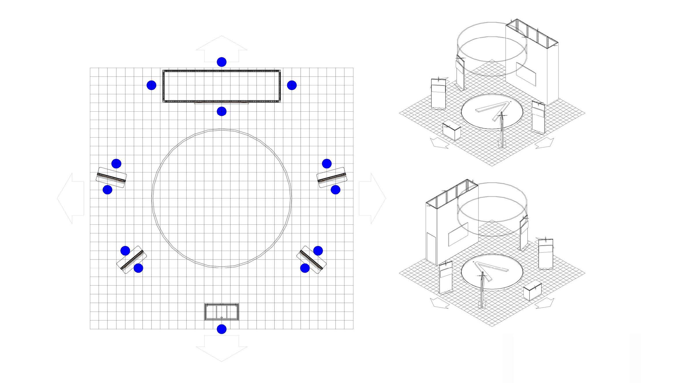
Early spatial planning and traffic flow mapping informed the final booth layout and modular placement.
Design Decisions
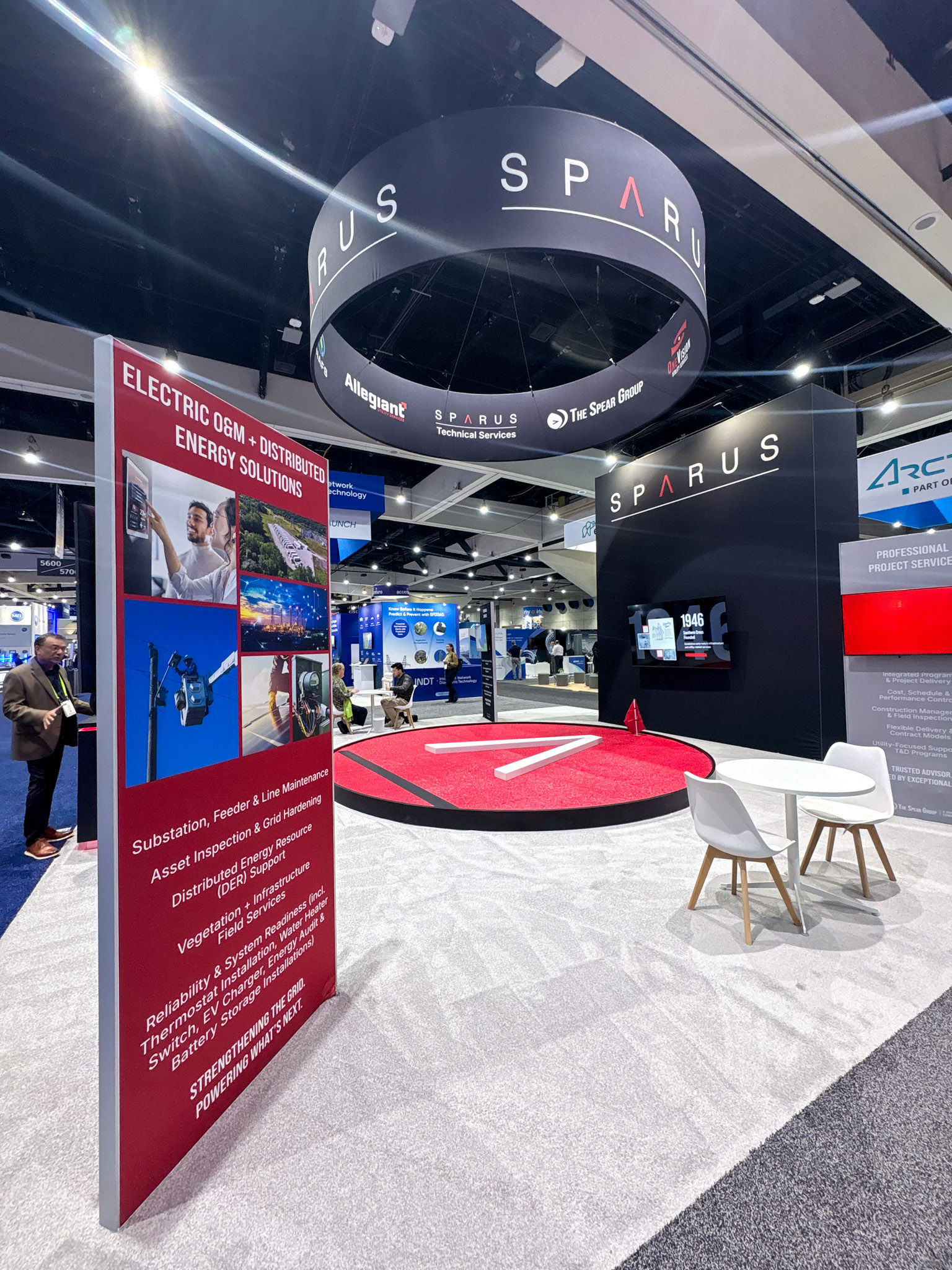
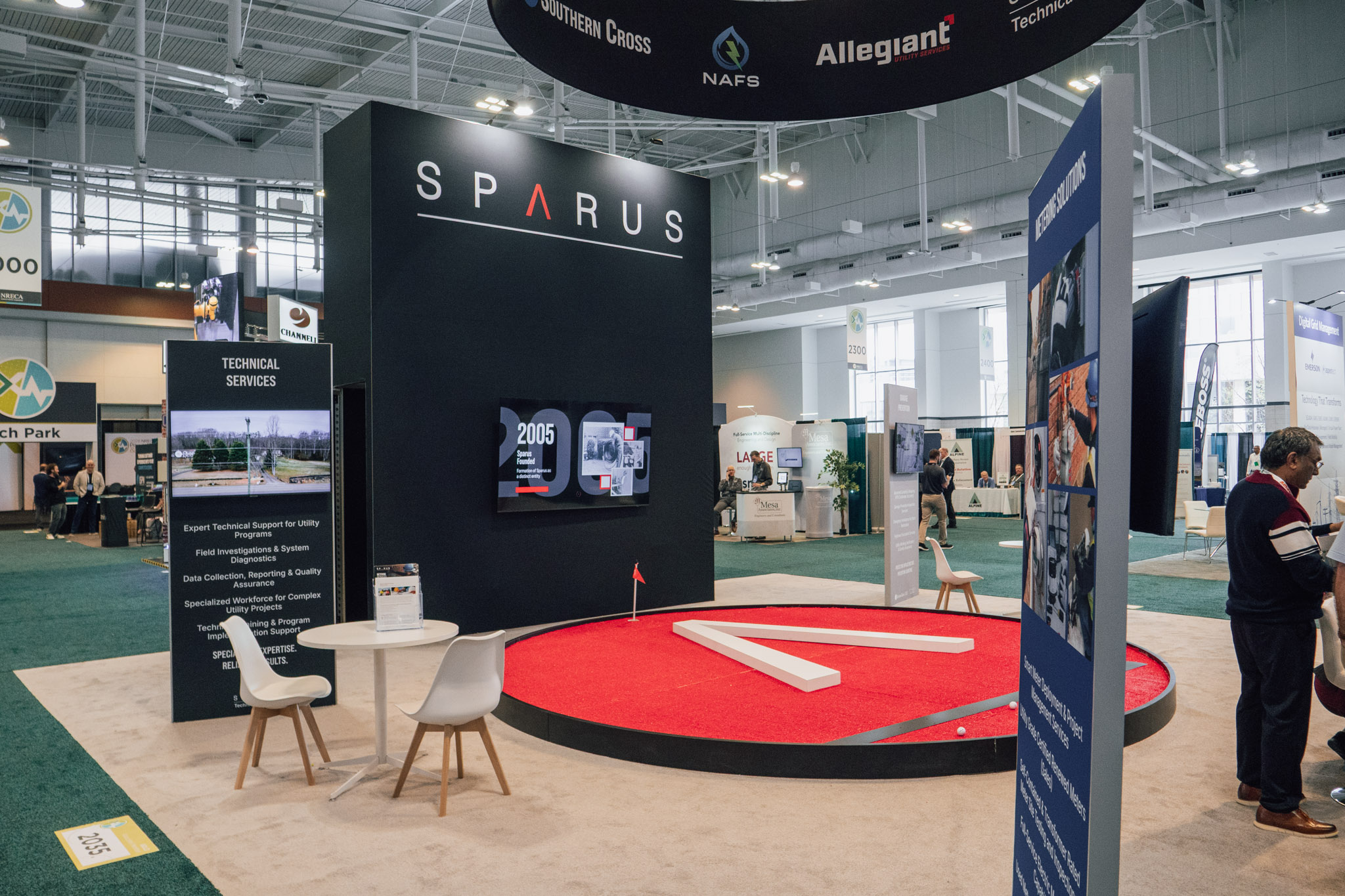
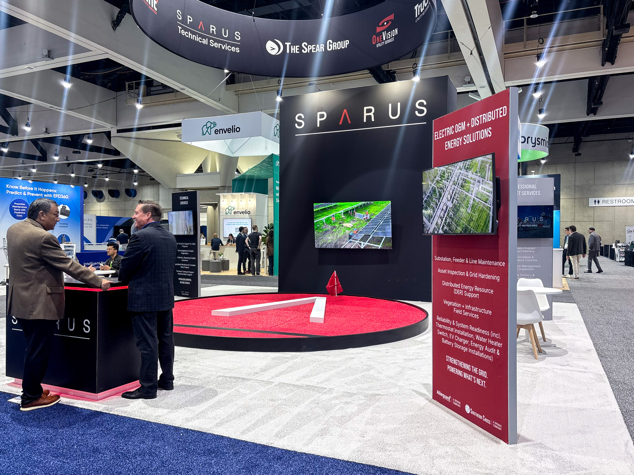
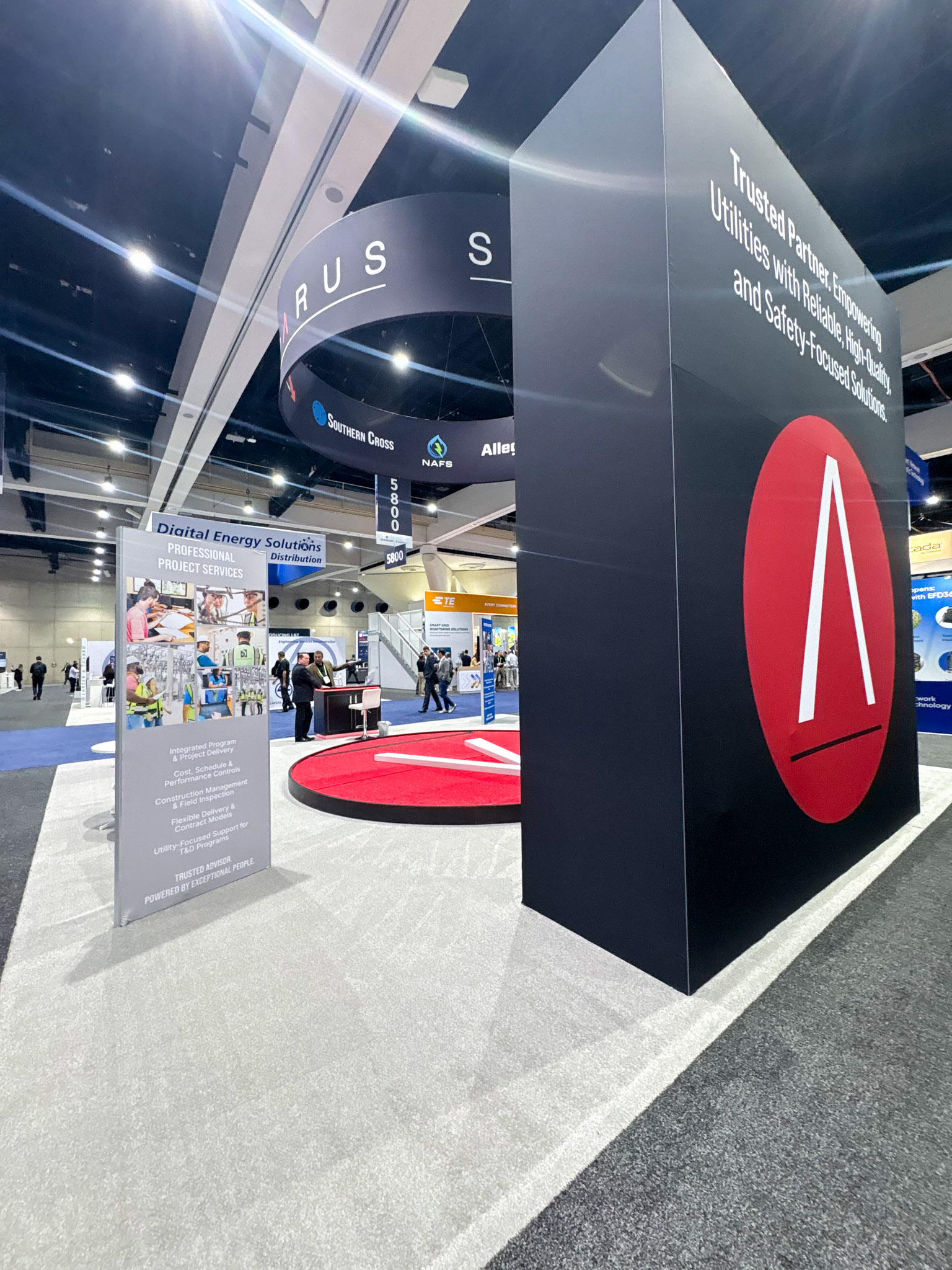
The environment needed to feel structured, not crowded.
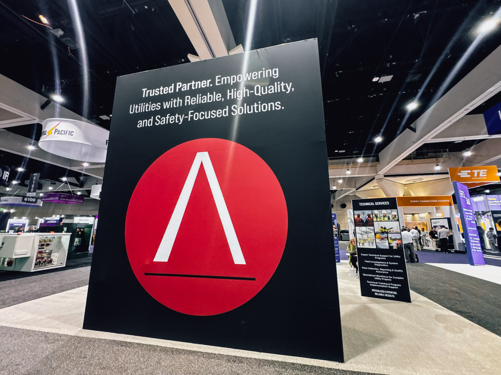
Black became the foundation, allowing content and color to carry meaning. Red was used sparingly as a focal point to anchor attention and define space.
Large-scale elements created visibility from a distance, while modular panels delivered clarity up close. Each element played a role in reinforcing hierarchy so that nothing competed for attention.
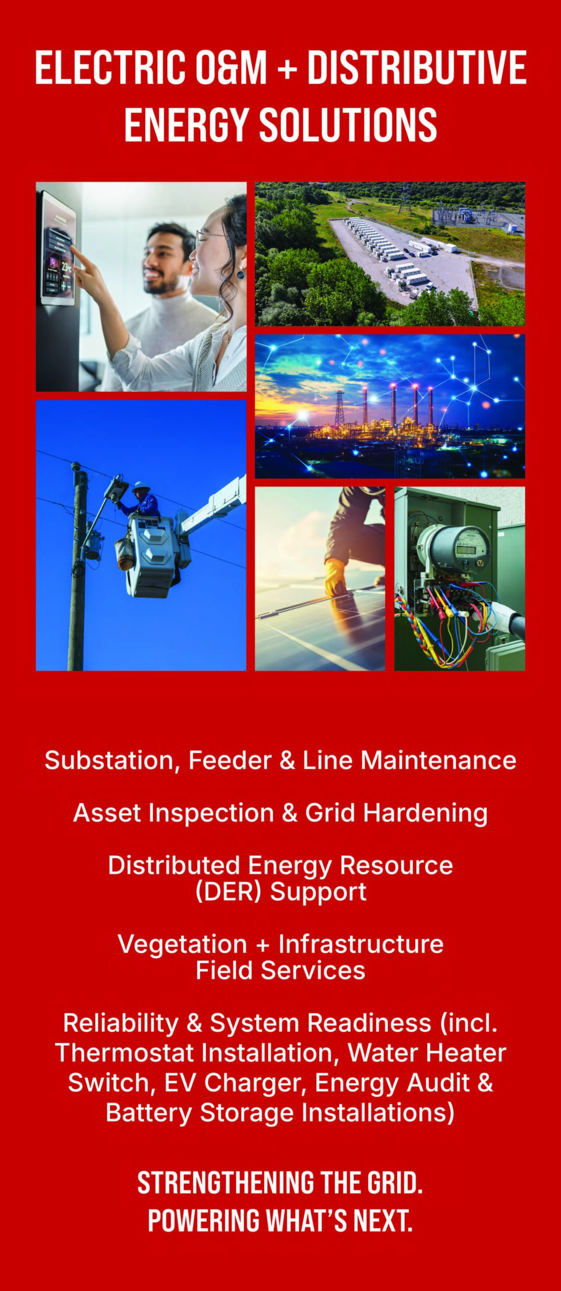
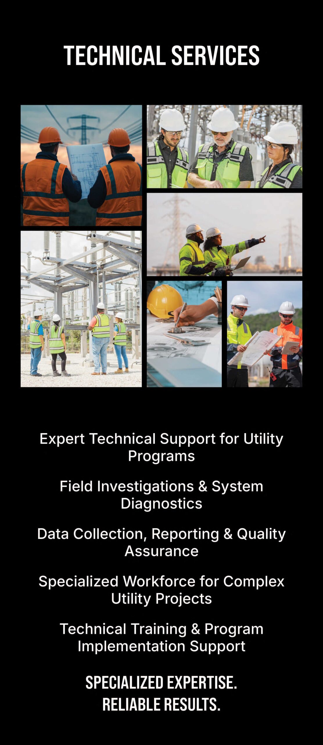
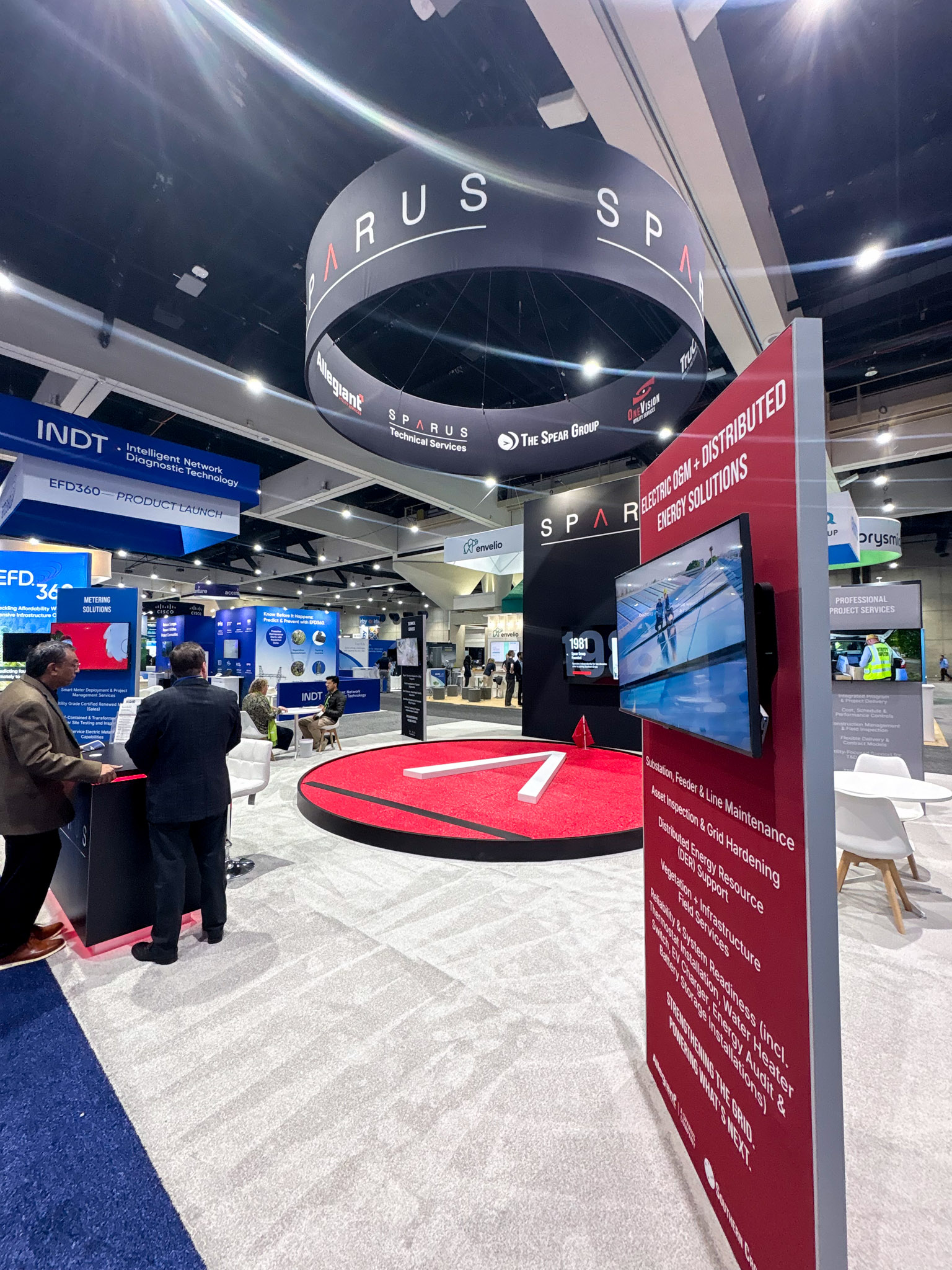
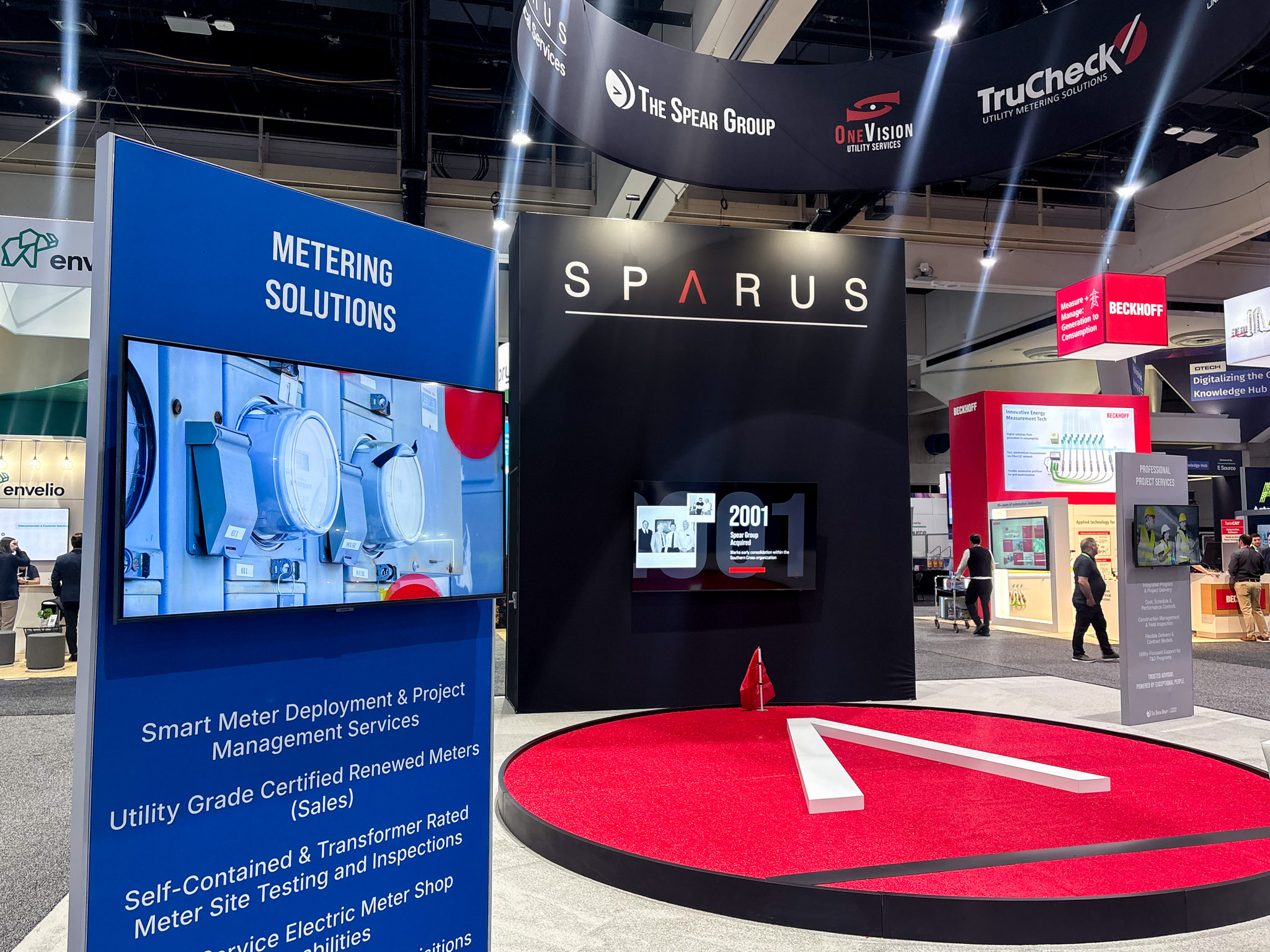
Modular System
Each service area was designed as a repeatable structure
The layout, typography, and content hierarchy remained consistent, while color and imagery differentiated each offering. This created a system that could adapt across different shows without starting over.
It was not about designing one booth. It was about creating something that could evolve.
Spatial Experience
The layout was intentionally open and circular, allowing people to move through the space naturally.
There were no forced entry points or rigid paths. Attendees could approach from any direction, engage where it made sense, and move on without disruption.
The central platform acted as a visual anchor, creating a sense of place within the environment while reinforcing the overall structure.
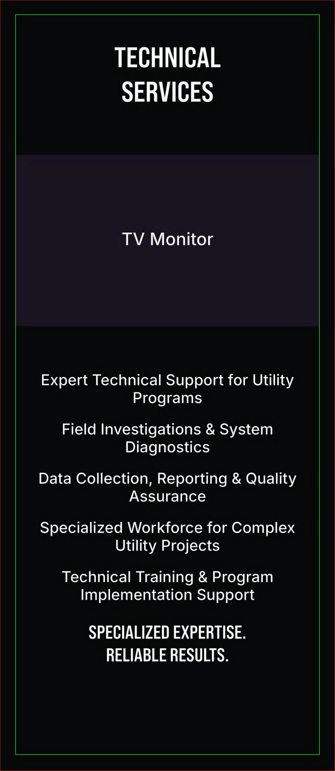
Typography & Content
Typography was kept simple and direct.
There was no need for heavy styling or visual noise. The focus was on clarity.
Messaging was concise and structured to be understood quickly, supporting real-time conversations on the floor rather than slowing them down.
In the Environment
Designed to be seen from a distance and understood up close.
Working Within Constraints
This project was built under real budget limitations, which shaped every decision.
Instead of over-designing, the focus shifted to reusable structures, modular graphics, and scalable solutions. The goal was to maximize impact without unnecessary complexity.
The result feels elevated not because of excess, but because of intention.
Impact
The result was more than a refined visual presence.
It created clearer conversations, stronger positioning, and a more unified representation of Sparus across its service lines.
More importantly, it established a system the company can continue to build on.
Design is not just how something looks.
It is how clearly it communicates.
This project focused on removing friction so the work could speak for itself.
Let’s Build Something Intentional.
Whether you’re starting from scratch or refining what exists, I’d love to collaborate. Let’s create something that feels authentic, strategic, and built to grow.