Brand stewardship + system design + real-world application
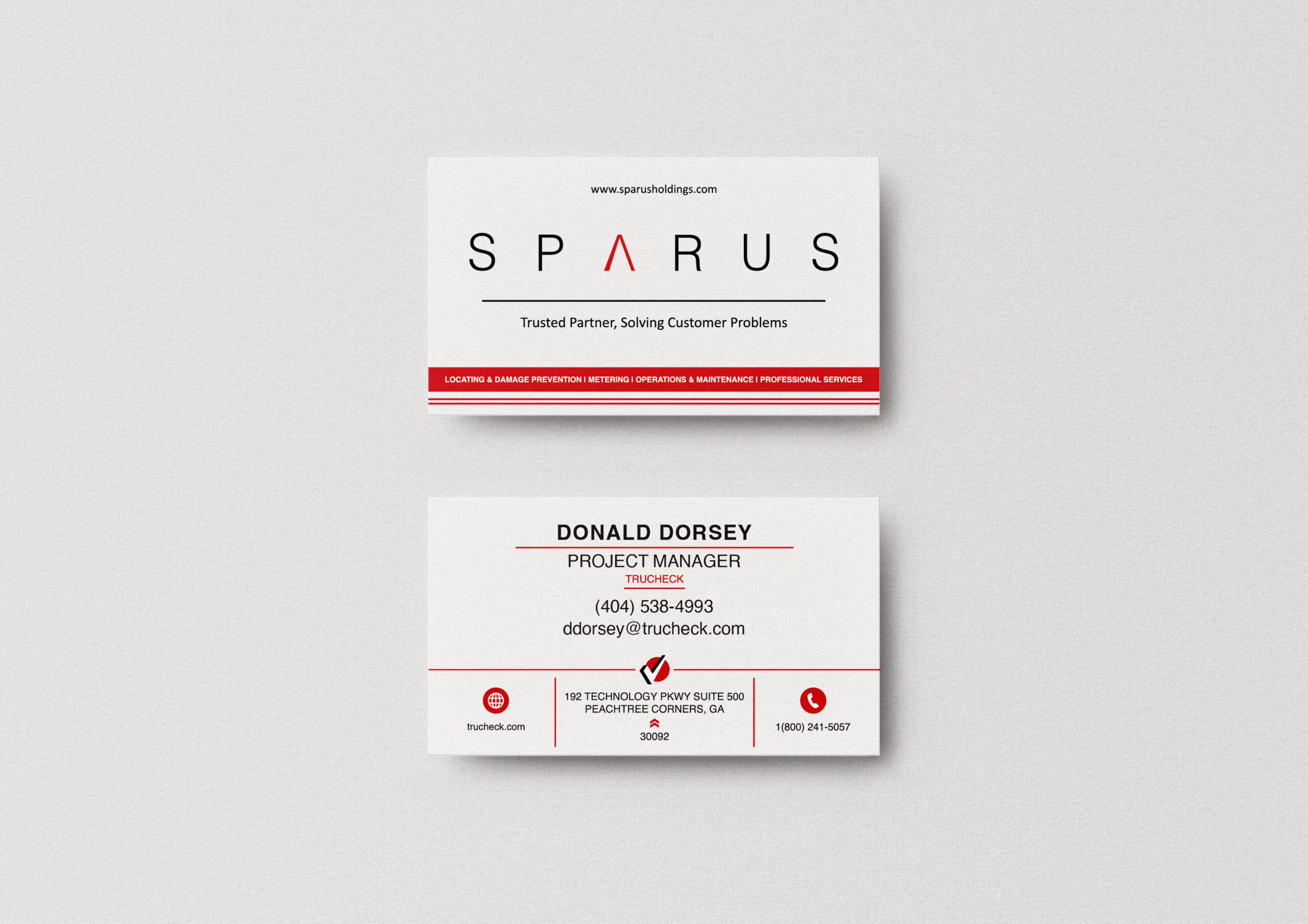
TruCheck
A utility-focused brand and digital experience built to communicate reliability, scale, and field expertise.
As part of Sparus Holdings, TruCheck required a strong, consistent presence across web, marketing, and real-world applications. The goal was to create a system that clearly communicates services while supporting ongoing growth, recruitment, and client engagement.
The Idea
TruCheck needed to balance clarity with credibility.
The brand had to speak to utility providers, municipalities, and large-scale partners while remaining accessible and easy to navigate. The website became the central hub for services, recruiting, and brand communication.
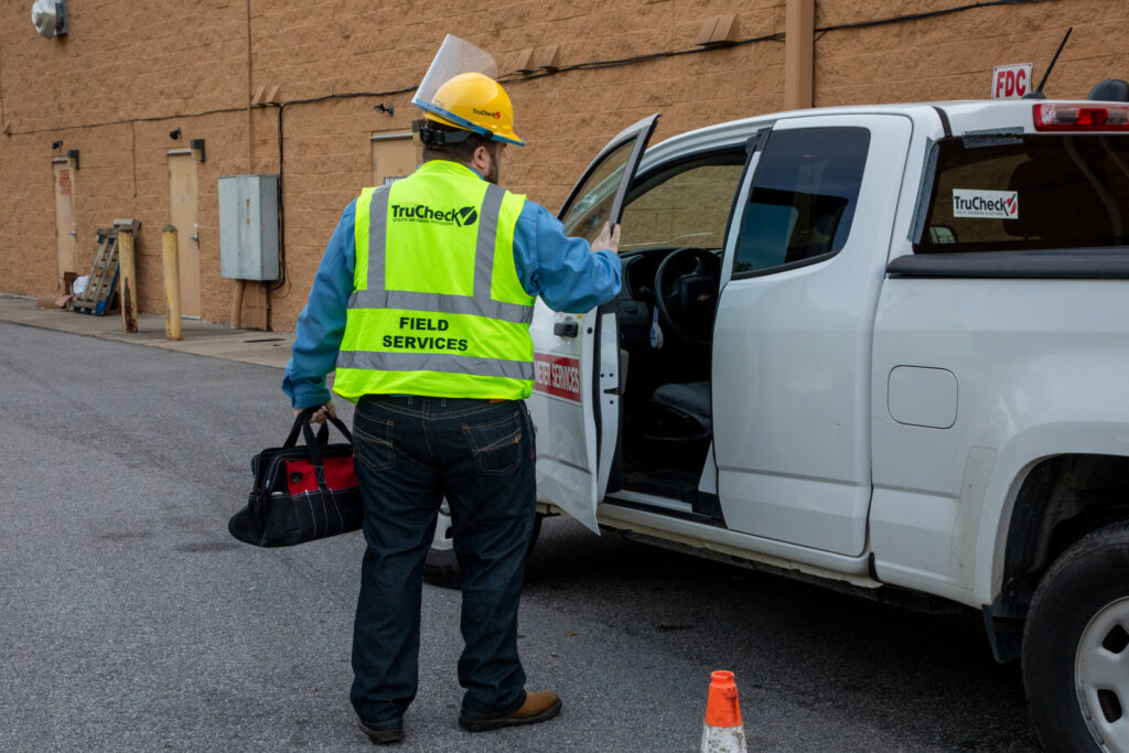
The focus was to create a structured, user-friendly experience supported by real-world imagery that reflects the work being done in the field.
Brand Direction
The direction focused on strength, clarity, and consistency.
Clean layouts, bold typography, and a controlled color system reinforce trust and professionalism. Red is used intentionally to guide attention and highlight key actions without overwhelming the experience.
The brand extends beyond digital, maintaining a consistent presence across marketing materials, trade show environments, and internal communications.
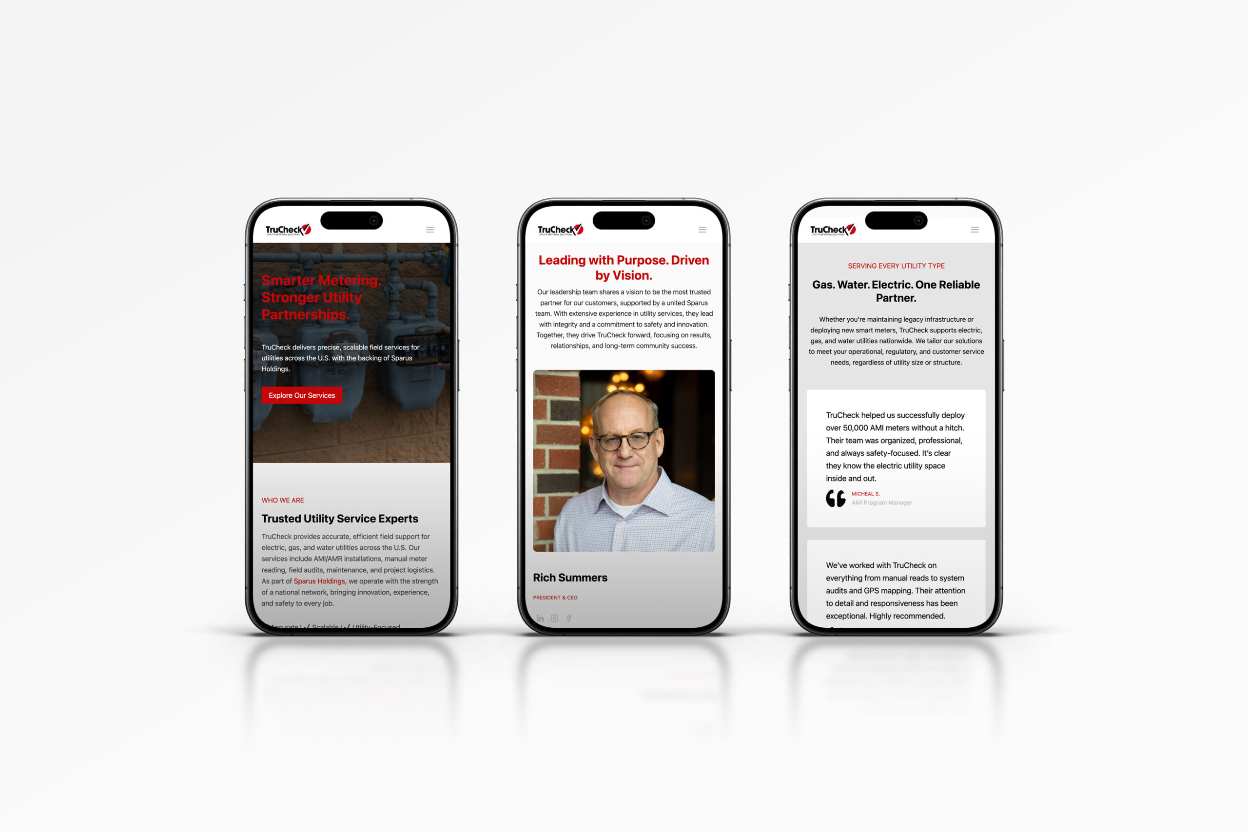
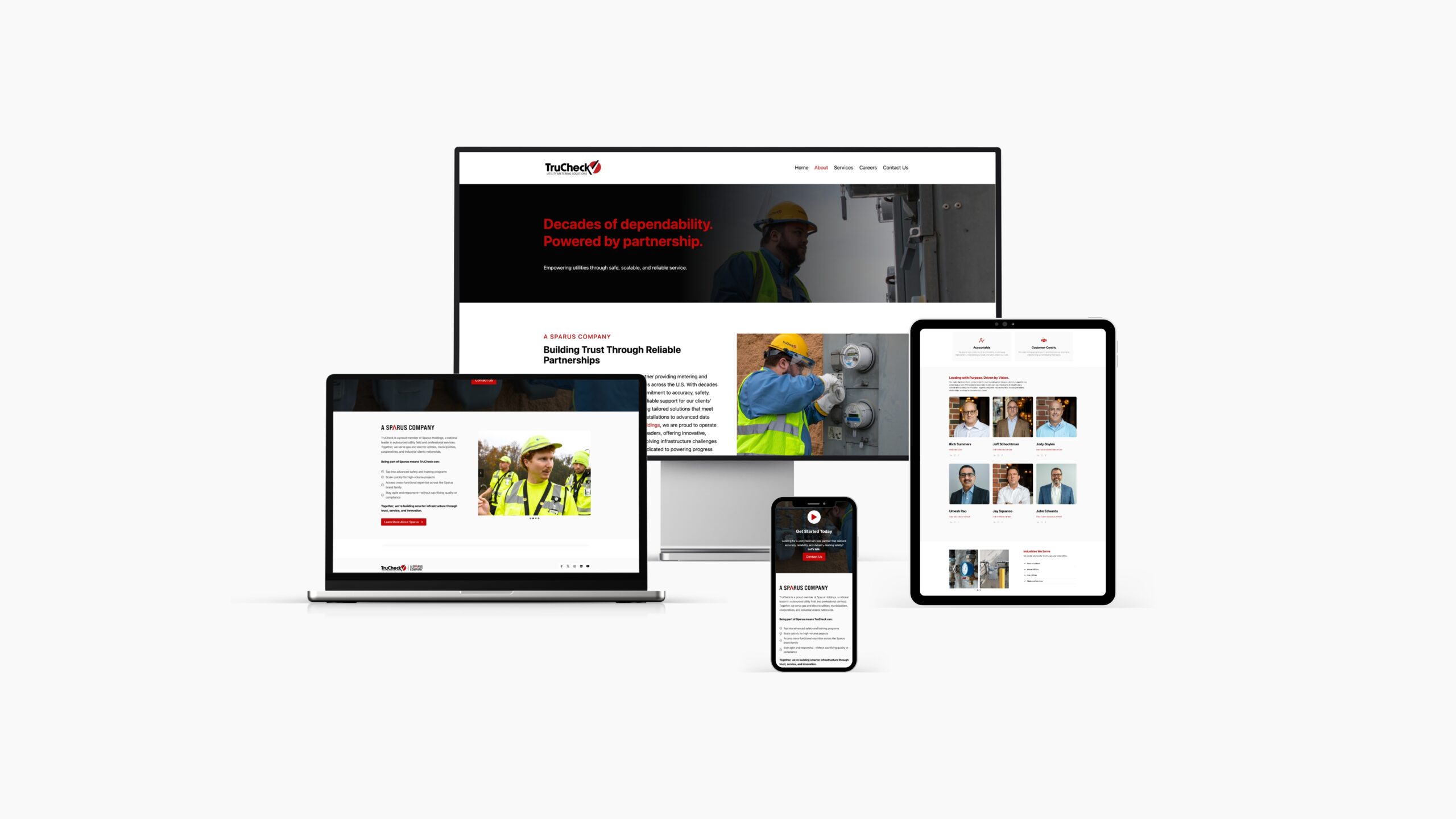
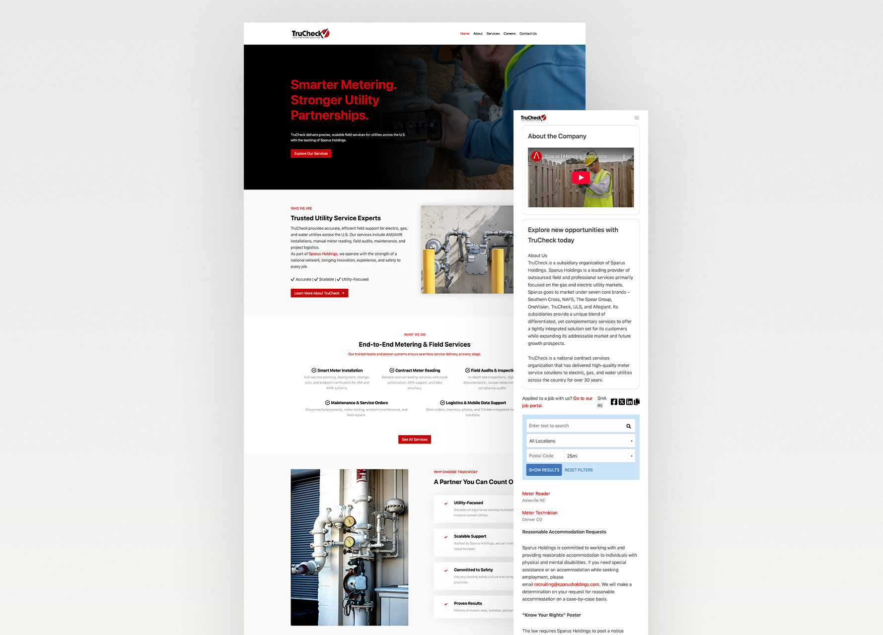
Web Experience
The website was designed to be both informative and highly functional.
Clear content hierarchy, structured service breakdowns, and strong calls to action guide users through the experience. The layout supports multiple user types, from potential clients to job seekers, without sacrificing clarity.
Each page was designed with scalability in mind, allowing the site to evolve alongside the business.
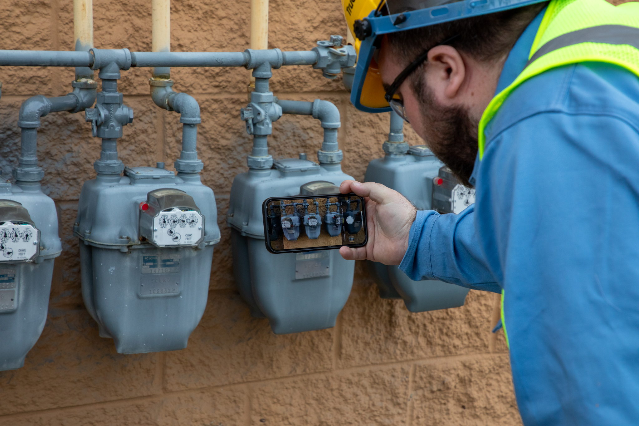
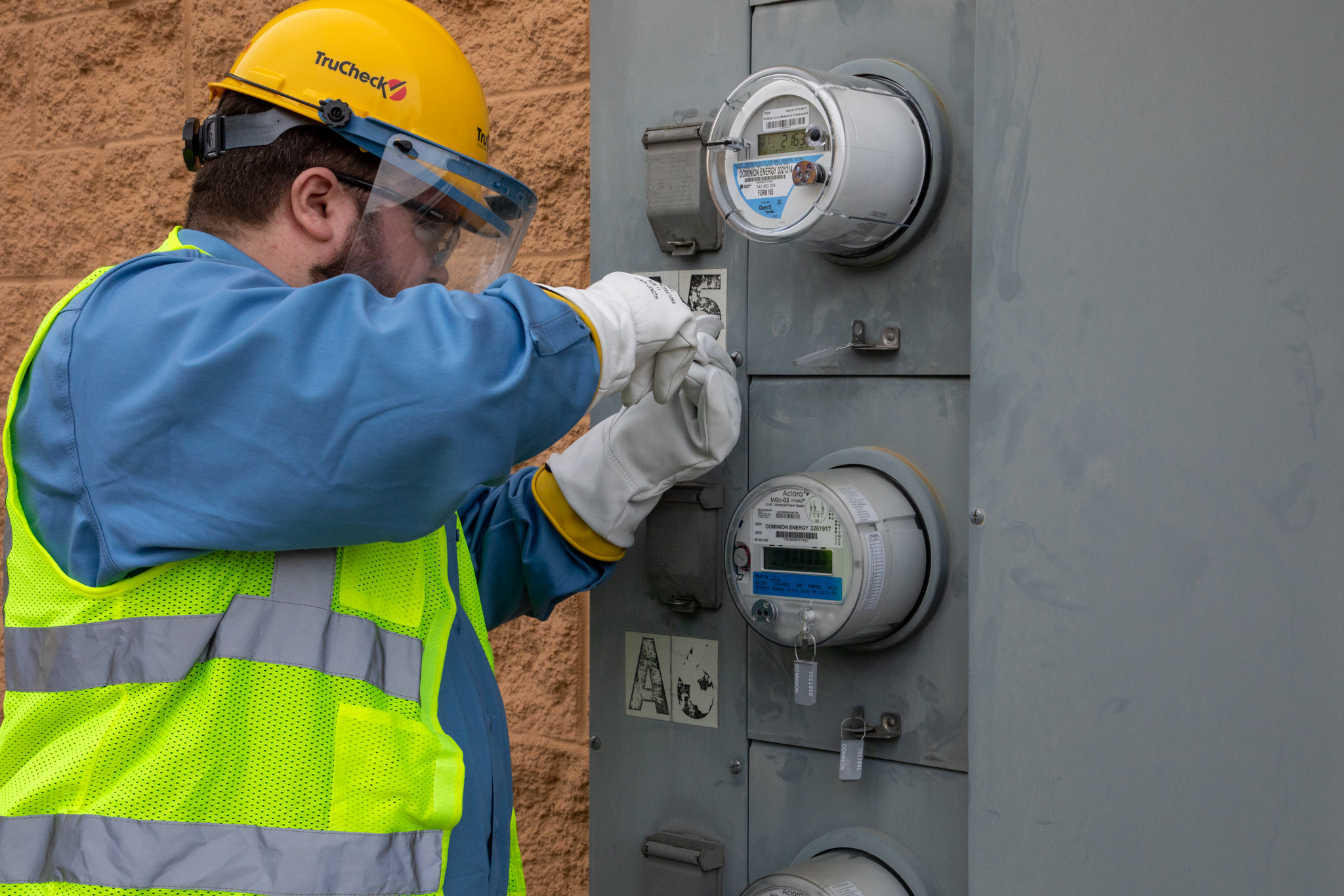
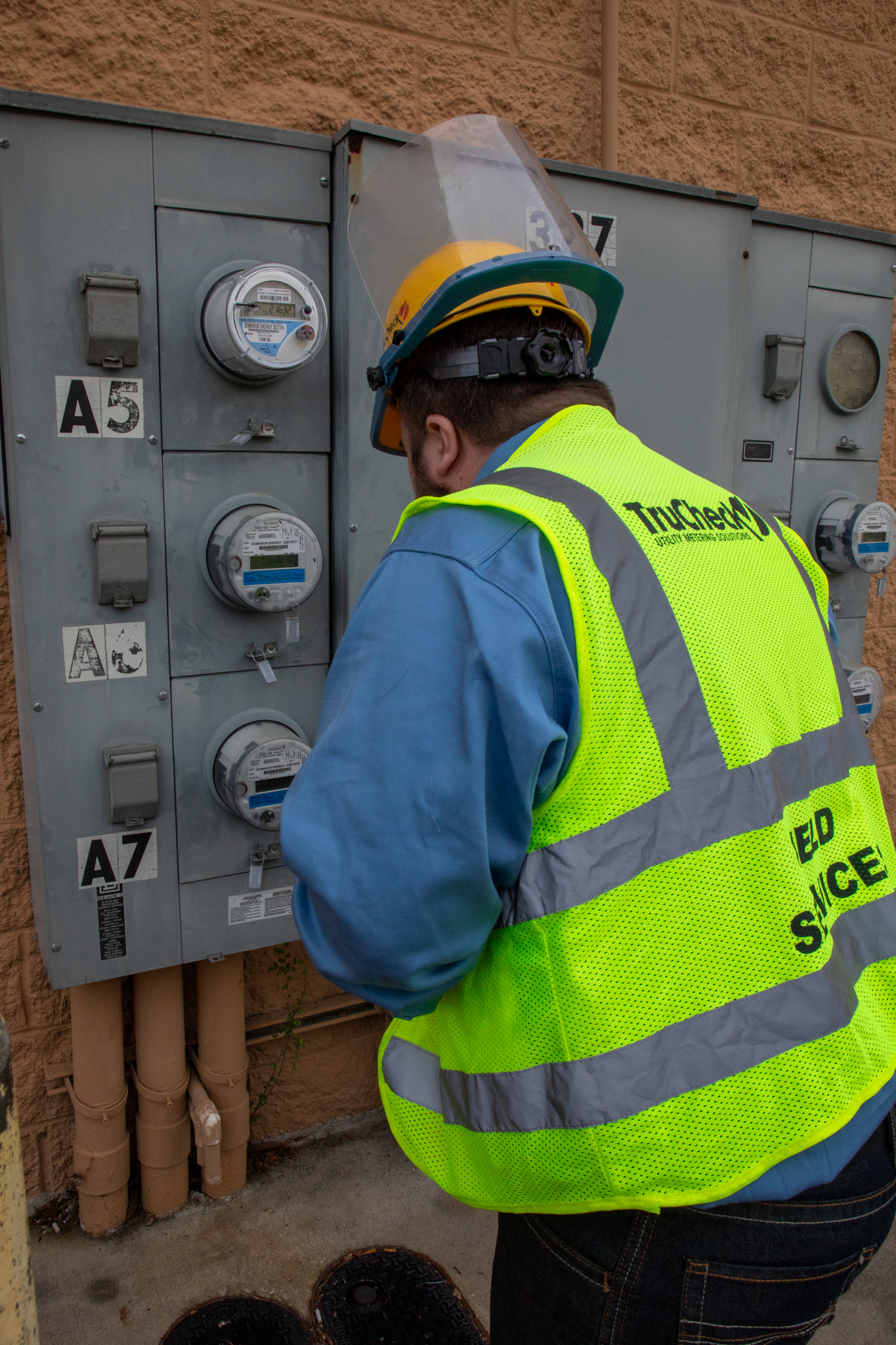
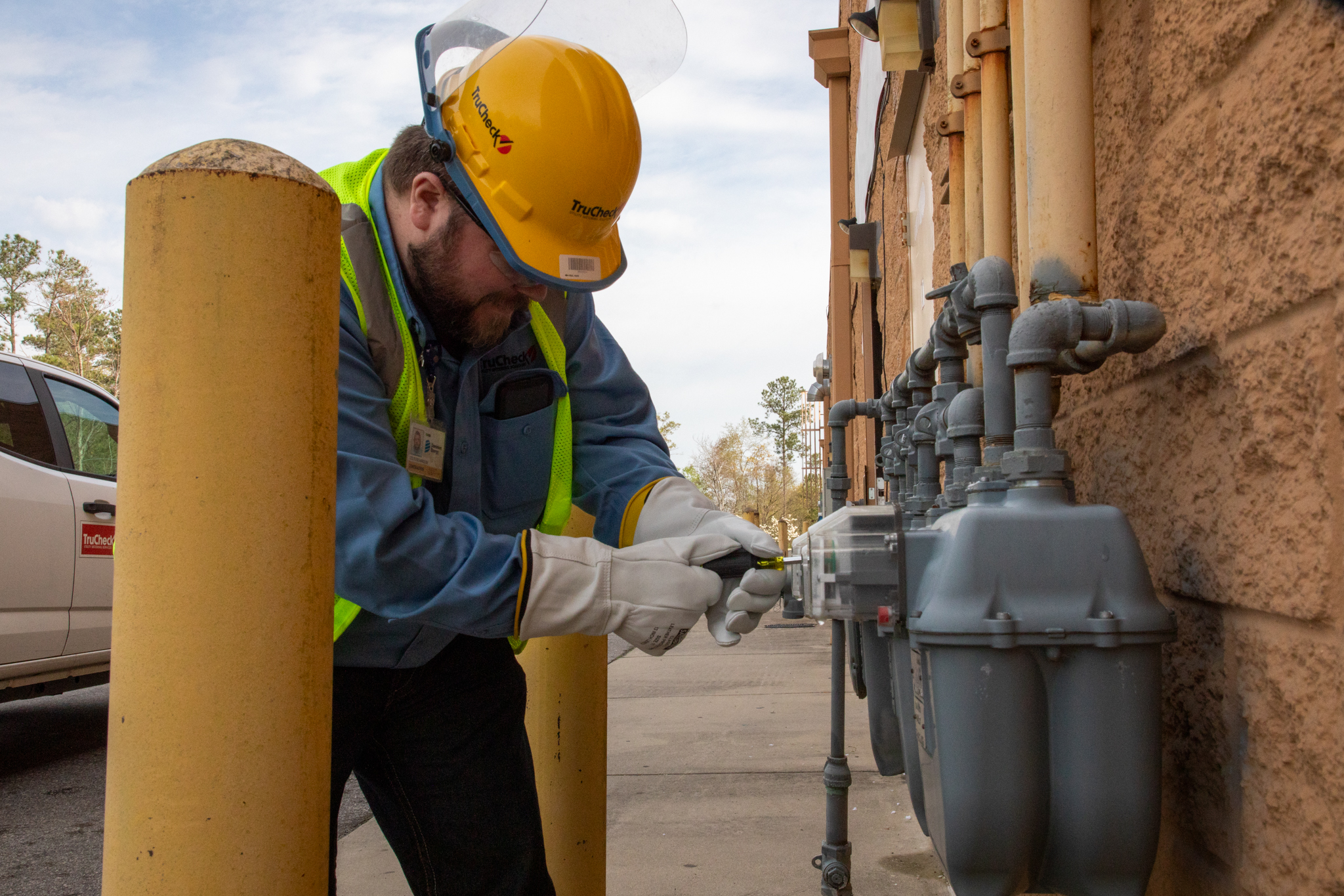
Content & Photography
Original photography was created to support authenticity across the brand.
Rather than relying solely on stock imagery, real field work was captured to reflect TruCheck’s services in action. These images were integrated across the website, marketing materials, and internal content to create a cohesive and credible visual identity.
The result is a brand that feels grounded, real, and connected to the work being done.
Product & Marketing Application
The identity extends across multiple touchpoints.
From trade show materials to digital marketing and internal communications, the brand maintains consistency across every application. Booth graphics, supporting visuals, and campaign assets were designed to align with the overall system while remaining flexible for different use cases.
Impact
The result is a modernized digital and brand experience built to support both field operations and long-term company growth.
From website design and responsive development to photography, branded collateral, and ongoing content management, the work created a more unified and professional presence across TruCheck’s digital and marketing ecosystem.
By combining real-world utility photography with a cleaner, more scalable visual system, the brand now better reflects the reliability, precision, and operational expertise behind the company’s services.
The project continues to support TruCheck’s visibility, recruiting efforts, service marketing, and connection to the larger Sparus Holdings network.
Let’s Build Something Intentional.
From brand systems and digital experiences to visual storytelling and strategy, every project is built with clarity, purpose, and connection in mind.